What’s the first thing you look at when you land on a website?
Pictures, right? You’re not alone. According to a study republished by Forbes, “91% of people prefer interactive and visual content over traditional, text-based, or static media”.
Before a visitor reads or hears anything, they hone in on visual content. The first image they encounter is your logo. The color, shape, style, and other key visual elements collaborate to evoke emotions and metaphors. Within seconds, your visitor has formed an opinion about your business.
Did you know that your logo is a powerful extension of your brand? It helps form a strong first impression, opening the door to further positive interactions. Just take a look at Sharp net and you’ll see entertaining designs that really steals the show. Therefore, you need to use this opportunity to become immediately recognizable and memorable. More importantly, the logo should reflect your brand’s message and stand out in the crowd.
Can your Logo do the Same?
If you feel your logo is missing these qualities, then you’re on the right page. This blog discusses some of the essential traits your logo needs to become successful.
Creating a professional logo design is not rocket science. In fact, there’s a surmountable amount of freedom where you can explore all your options. Aim to utilize various design elements to create an original and unique logo for your brand. However, it’s better if you understand which characteristics your logo needs to make an impact in the crowded commercial landscape. More importantly, you need to know how to strike a balance between them.
Sounds overwhelming?
It doesn’t have to be. We’ve picked out iconic logos from various industries and identified attributes that make them popular. What better way is there to learn about logo design than to study the best examples in the market.
Let’s see how famous logos are killing it from a design perspective.
1. Shape your Brand Image
Logo design is about visual communication. But did you know that every shape has a special meaning? More interestingly, specific shapes can evoke emotions and feelings.
This is what you want to think about when designing your logo. Highlight the emotions you want your viewers to feel. Moreover, identify the shapes that align with your brand’s identity.
Before you can do that, you need to understand what each shape represents.
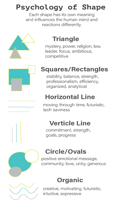
Now apply this information to the examples below and decipher what each company is trying to convey to its customers.
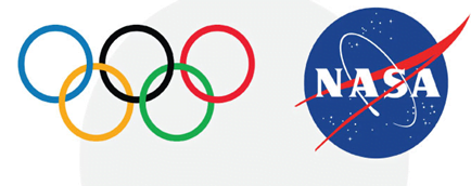
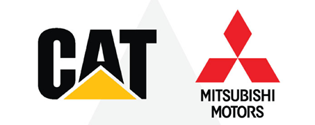
While the circles in the Olympics and Nasa logo emphasize unity, the triangles in CAT construction and Mitsubishi Motors convey power, improvement, and continuous motion.
As you can see, the shape you choose will speak to your target audience. So choose wisely.
2. Tap into the Potential of Color Palettes
Just like shapes, the color you use influences human behavior and perceptions about a brand. But color association varies from culture to culture and country to country. For instance, green in the US symbolizes money, while purple represents evil in Japan.
However, generally, businesses use colors to evoke the following emotions:
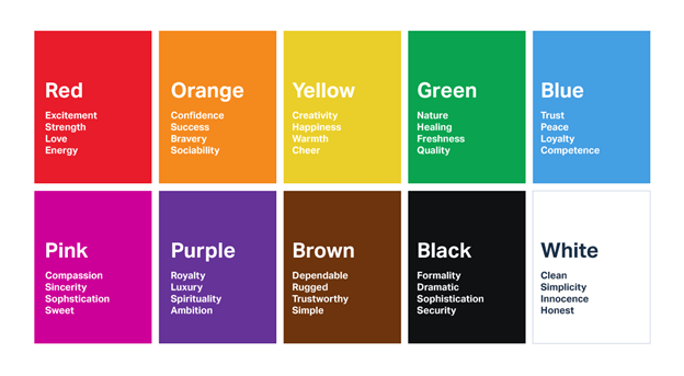
When creating your logo, keep in mind the value and connotation behind each color. Look at the following examples to fully comprehend how companies have used the power behind the color schemes.
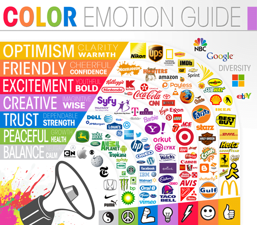
If you plan on using more than one color, make sure the combination is aesthetically appealing and delivers the desired message. Remember to coordinate the color of your website design with that of your logo.
3. Typography Matters
Did you know that people can predict your personality through your handwriting? The same can be said about the typography of your logo.
So besides what the letters say, the way the text looks can significantly affect people’s perception of your brand. From the font you select to the size of the letters, everything influences your brand image. Using the wrong font just may end up destroying the credibility and reputation of your brand.
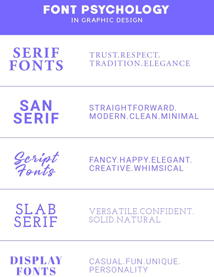
No matter what typography you select, make sure that neither readability nor legibility is compromised. Let’s look at more logo designs to help you gain some inspiration.

The curved edges of the Ford logo evoke a carefree and creative outlook, while the bold font and strong lines in the Shell logo reflect a company with a strong standing in the business world.
4. Keep it Trendy
As you develop your logo, don’t be afraid to get creative. Reimagine fonts, shapes, and sizes to make your brand truly unique. Companies often redesign their logos over the years in order to adapt to changing trends.
Just like you update your wardrobe to stay up to date with current trends, your logo should incorporate new design trends. This ensures your brand remains contemporary and relevant.
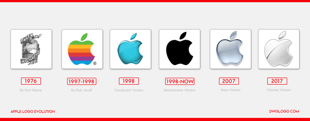
Apple’s logo has evolved over the years, yet its simplicity remains even to this day. The rainbow-colored icon coincided with their first color display computer. Then it became a shiny chrome and later a flat color. No matter what the style, all the logos are synonymous with the Apple brand- the sleekness and sophistication typical to Apple products.
What this shows us is that it’s okay to change a few aspects of your logo but not the entire design. You want your logo to be trendy but not change it so much that people do not recognize it at all.
That is why Apple never really changed its minimalistic design nor attempted to replace the bite. These are traits that continue to make Apple’s logo easily remembered and universally recognized.
5. Create Intrigue
Let’s state the obvious. Some brands incorporate business cues in their logos to tell consumers exactly what their business is about. For instance, a logo with a tooth makes it clear that you are a dentist.
But some brands like to add subtle cues. Have you ever wondered why all the Apple logos have that notorious bite? What does it signify? No one really knows for sure, but ‘the bite out of an apple’ may be a play on the word ‘byte’ as in megabyte or gigabyte or a metaphor for the bite of knowledge users get from using Apple products.
But there are numerous logos around the world that also have a ‘secret’ meaning. Did you see an arrow in FedEx, and the number 31 is in Baskin Robbins’ logo? Both are important symbols that represent the personality of the brand. The arrow depicts speed, movement, and precision (important traits for a delivery and logistics company), while the 31 in BR highlights the iconic 31 flavors of ice cream.
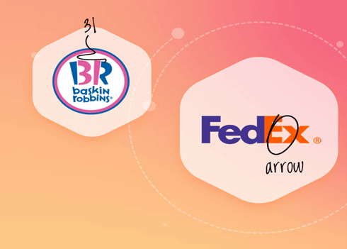
Hidden meanings can give you a creative edge. Add a clever factor to create an aha moment and enhance brand appeal. Though this is not a must-have feature, adding an element of intrigue not only makes your logo unique but it makes people ponder over your logo longer in order to decipher its secret message. This offers your logo a greater chance of your logo becoming memorable.
6. Become Versatile
Why do people recognize Nike’s swoosh? The brand has built a brand identity – alongside trust- with its exemplary products. Therefore, the logo does not need to be accompanied by text to make a mark on its target audience.
But let’s take this trait a little further. In today’s marketing world, you need to design a logo that is versatile so that it can be positioned anywhere without issues, in tiny in-app ads as well as on huge highway billboards.
While it’s essential that your logo is flexible with respect to scalability, you also need to create different versions of your logos (referred to as a responsive logo). The goal is to incorporate similar elements in all versions so that they are relatable and recognizable to your brand.
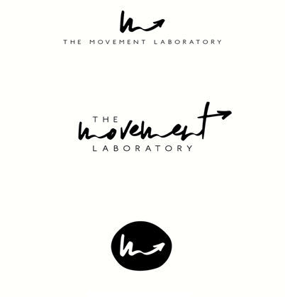
Notice how The Movement Laboratory created different-sized variations of their logos but kept all their styles consistent.
Over to you
Successful logos demand a good dose of creativity. All you need to do is learn how to apply the various design elements mentioned above. Use everything from color to typography to styles to create a unique logo that will make heads turn. If you have any other logo design traits that we have missed, go ahead and leave them in the comments section below.
